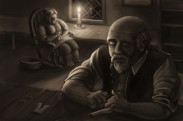
In an effort to share a bit more of my stuff and talk about how I work, I thought I'd try and do some of the same, although obviously not with work near their level. I just completed this piece below as an illustration for a class and had a lot of images available to show the progression - I've taken to working on a new level any time I reach anything that feels like a milestone so I can go back and see how things are coming. It's helped a lot in keeping me on pace and on track.

The piece was an illustration from the story of the Cobbler and the Elves. We were given three stories and told to find scenes from them we wanted to illustrate and take to a finished state over a couple of weeks.
I ended up selecting this piece. Now, this is where I ended up causing myself the most heart-ache. Instead of going in and doing a tighter pencil drawing, I just used my thumbnail. Foolish, lazy mistake. Every time I do that in an effort to save time I end up causing myself WAY more work. It's the same way with animation - if you don't put in the planning work at the beginning, it'll cost you a ton more heartache later when it gets a lot more complicated. Had I been wise I would have tightened up and resolved all of the shapes, the detail and the perspective here rather then trying to do it in paint in Photoshop. Live and learn, I suppose.
To start, I laid down a warm medium grey/brown tone as my base and began painting in my base values roughly to get a decent feel for the illustration and composition. Again, had my pencils been better, I would have been able to solve a lot of problems here, such as the cobbler's wife, the drapery and filling in the dead space.
Once I reached a certain point I turned off my pencils so I could begin working with the actual values. This is really where you know if a painting will work or not - does it read without the linework?
Here I began increasing contrast slightly, defining a little more of the forms and adding in some fill light, building up the shadow shapes and trying to figure out a bit more of the forms.
At this point my instructor gave me a great little paint-over on my piece, first starting with a line sketch over the Cobbler, helping to round out his shape and add better detail.
He also did a scrub-in of light and dark to add better contrast and form to the piece.
I selected my old cobbler and just blurred him out, giving me a decent base to paint over without getting wrapped up in the details.
Here I went in and started tying down the changes to the forms, adding in light and form to the wife, the cobbler's head, arms and beard. I also added the clothing for the elves he was working on onto the workbench and filled some of the dead space behind him with a shelf of some kind. Lots of defining shape and form.
More definition, more contrast. I should have worked from more reference of candle-light, there is far too much ambiguous and ambient light for a piece that has the single-point lighting of the candle.
At this point, I decided the lighting was still too ambiguous so I just did a huge rough lighting pass on a new layer, pushing the idea of cast light and shadow and increasing the contrast greatly.
I then blurred that layer and used its information to paint up new light and shape into the forms.
Softening the light a bit more, giving a warmer feel and adjusting the levels for clarity.
A final levels and contrast adjustment and the piece and I were ready to part ways.
I wouldn't say this is my strongest piece ever, but I learned a lot from the process and enjoyed working on it a ton. It was one of the first digital paintings I'd done where I felt like I was in control of the process and enjoying it.
I did nearly the entire piece using a single brush, one I gleaned from a tutorial video by a stellar game artist, Jesse McGibney. He demonstrates the brush, along with a number of his other techniques, in the following video.
The brush itself is actually pretty simple - a rounded corner square with the direction set to follow the direction of the stroke, with size, opacity and flow set to pen pressure. That's about it, but it is remarkable how much it creates a feeling of actual painting.
This was also my first piece working with the new painting tools in Photoshop CS5. I have to say, I really, really like them. The new color picker that lets you compare your selected color to your previous color is an absolute revelation, and I can't imagine working without it any more. Great stuff.
Anyway, I hope this post was useful to someone. If anyone has any comments or other process work/tips to share, I'd love to hear them.


No comments:
Post a Comment